
In Part 2 of the FMR Analysis Series, we look at how rents have changed by county and state over the years. This series analyzes the 40th percentile fair market rent (FMR) for a 1-bedroom (1BR) across the U.S. Therefore, it will refer to this measure whenever rent is mentioned.
Changes Over Time
To understand affordability over time, we need to see how rental prices have changed. Looking at the boxplot below, we see that rental prices fluctuate year to year.
Surprisingly, the counties with the highest 40th percentile FMR in 2019 (mentioned in the first blog post) do not exhibit the most drastic year-over-year percent change. However, the most expensive counties still experience high changes in rent on average (16% in 2019).
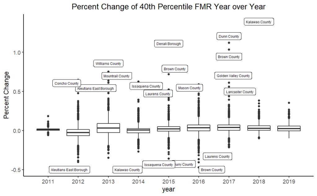
Rental prices for most counties increased between -1 to 3% from the prior year, but there are many outliers where inflation ranges from .4 to 1.4%. Reasons for outlier behavior exceed this series’ scope.
Counties with the highest year-to-year percent change in FMR for 1-bedroom from 2010 to 2019 are shown below.
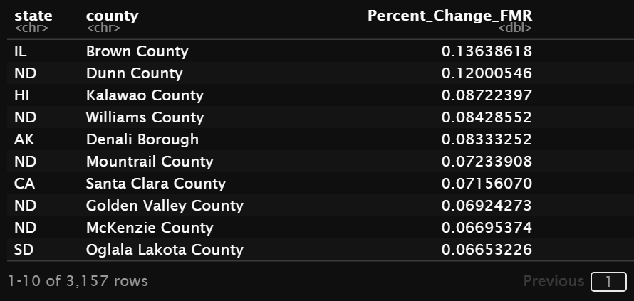

While not in the top 5, we see some of the most expensive places to rent from appear lower down the list. Santa Clara makes it into the top ten. Marin and San Francisco rank in 11th and 12th place.
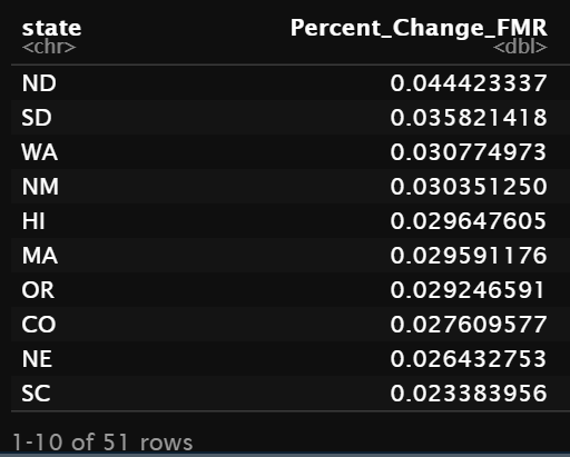
States with the highest fluctuation in rent
Surprisingly, CA is not on the top ten list.
Sources:
R Code: https://github.com/jpagaduan/Social_Science_Projects/blob/main/FMR_Over_Time2010_2019.Rmd
Explore the data visually with this Tableau dashboard:
- 40th Percentile FMR for a 1BR in the U.S. (Rent & Salary Distributions Tab)

Leave a comment